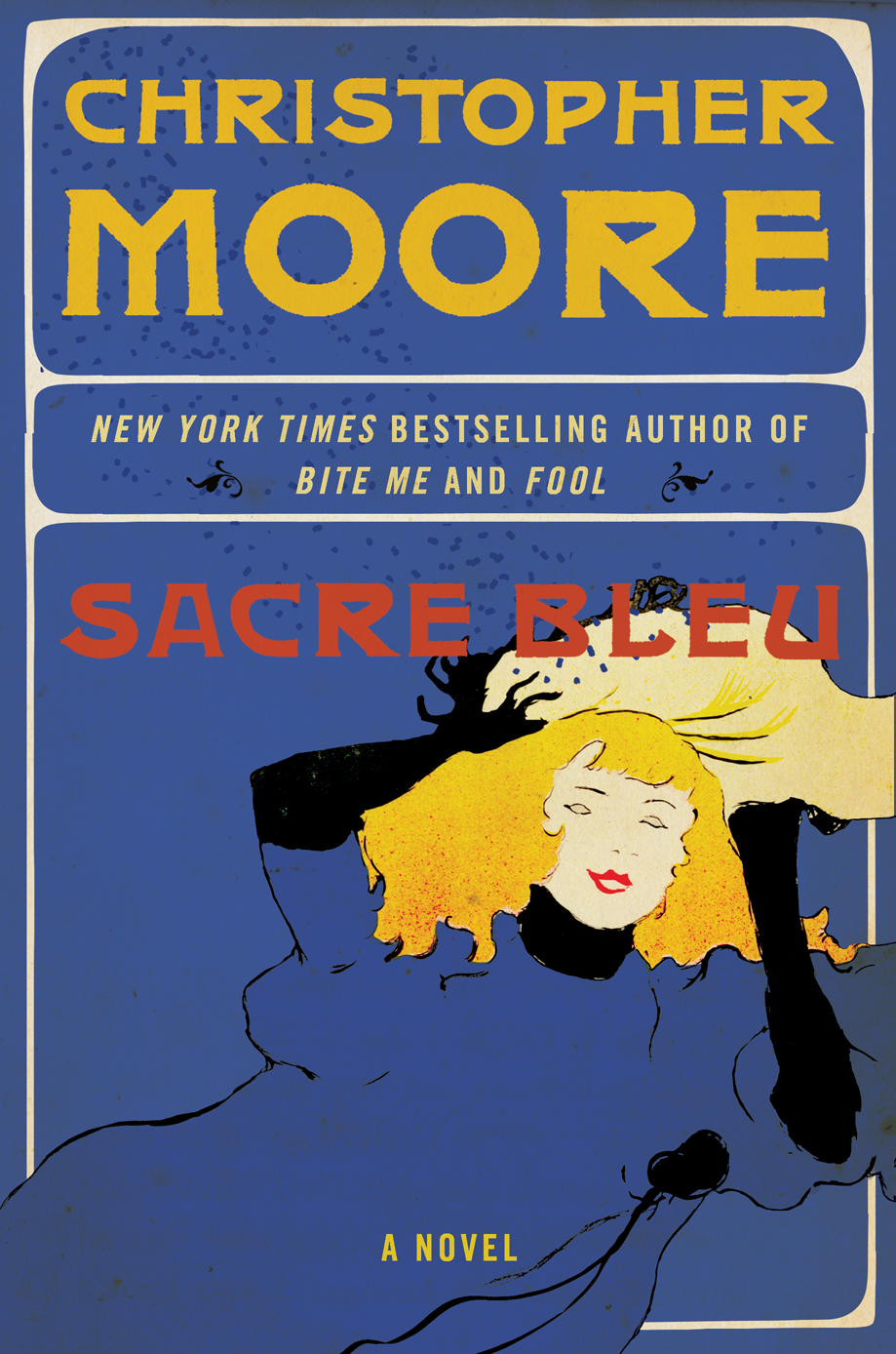
Vote for your favorite cover for Sacré Bleu. You say: “But I don’t know what the book’s about yet?”
Exactly. Pretend you’ve walked into a book store, or a Costco, whatever, and you’ve never heard of the author, which of these covers would make you pick up the book to see what it’s about. Make a mental note of the title or number of your favorite and vote on Facebook here: http://www.facebook.com/questions/10150348340820067/?qa_ref=qd
We’ll call this
1. ART NOUVEAU

2: MOULIN ROUGE

3. ENCHANTED PALETTE

4: PINCE-NEZ & DERBY

5. VINCENT


I definitely have to go with number 3. I am really excited for this book! Do I know what it’s about? Does it matter when it’s a Christopher Moore book?
Pince-nez and derby all the way!!
3 is most in line with past books – but I like 2 best
I like the Enchanted Pallet the best… however… if I’m following your instructions and pretending to know nothing about the book or author… my guess is that on first glance, the Pinz-Nez and Bowler or Vincent’s Ear would sell better… more mass appeal.
Let’s go with number 3 please!
2. ENCHANTED PALLET, I love the colours, I love the art, it looks sharp. If I saw this at the bookstore, I’d buy it.
2. ENCHANTED PALLET
My vote is for Enchanted Pallet. I think it’s beautiful.
My vote’s for #3, the derby/pince nez one. Something very classy and simple about it.
Art Nouveau
#3 PINCE-NEZ & DERBY all of the way. It is the one that gives me that instant laugh that I’ve always associated with most of your covers.
I like 3 and 5. The others would mess up the consistency of my Christopher Moore shelf. Now when is the book tour???
2. ENCHANTED PALETTE – I just love the color and the font. 5. VINCENT’S EAR somehow seems more Moore.
I can’t decide between #1, 4 & 5
Pince-nez & Derby!
They are all good, but I really dislike the choice of type on Enchanted Palette. I vote for PINCE-NEZ & DERBY, but I might change my vote for ENCHANTED PALETTE if the font were simplified.
I’m going with the Pince-Nez & Derby. They’re all good though. The Vincent one of course reminds me of another Moore classic: “Coyote Bleu.” 🙂
I like 3 and 4 but go with the one that fits the book best.ive loved all your book covers so far
After much scrolling up and down, I’m going to have to go with #5 Vincent. Your name is nice and big and on top. Easy to read. As much as I like #3, it doesn’t read very easily for me. I’d like to see more doodling on Vincent – maybe a bowler hat and a pipe or something.
#3 is the most eye-catching. Very pretty!
Tough call – but I’d go with 3!
3 or 4 Would probably catch my eye most, but I’m so excited about a new book from you that I really don’t have any rational judging skills.
I think if you used the layout & font from #5 Vincent but got rid of old bearded Geezer van Gogh and put the hot naked babe from #3 Enchanted Pallete on instead – we’d have a winner. Lets face it even most of us girls would probably rather see the babe than the bearded guy, unless it is an attractive bearded guy like you Chris !!!! There’s an idea do a stylized french portrait maybe something famous but put your face on instead.You could make it obvious as kind of a photo shop type spoof or even sneak it in there if you want to be subtle and really screw with your publisher. If we HAVE to choose one from the list just as it is – I’d go with #1 Art Nouveau.
Enchanted Palette! It’s beautiful! Can’t wait to have it on my book shelf!
#1, then #4 – can’t wait!
Enchanted Palette. If I knew absolutely NOTHING about your being a verbal ninja and deigned to judge books solely by their covers, that is the book I know I’d have to inspect further. There’s this lovely “What the fuck goes on between these covers?” quality to it– it manages to be seductive, yet enigmatic, only giving away incomprehensible clues as to what’s about to go down.
Vincent!
#3 is beautiful, but missing the Christopher Moore feel, not that those two things are mutually exclusive. #4 seems to have the right vibe.
Pince-Nez & derby for sure. The others are definitely eye catchers, but that one just looks fun.
My vote is for #5. It has enough Bleu on the cover, and the glassess on Vincent gives it the perfect amount of Sacre!!
I think 4 is quirky without being too artsy (lets face it, too artsy will turn more people off than on)…3 is also awesome and would make people stop and look. other than the font for the title, a little too hard to read.
Love the fonts and coloring on Enchanted Palette. Pince-Nez & Derby looks comedic. Vincent is also good.
#1 is very cool, a personal favorite, BUT I’m guaranteed to buy the book anyway and this cover may not be super “market” friendly. #4 , cute, but not nearly “bleu” enough…color or mood. So definitely, positively: VINCENT rules this one. Perfect.
I would go with #4. Not only does it look appealing and would make me want to pick it up to see what it’s about, but it also goes along with previous book covers for Christopher Moores novels. Kind of get the best of both worlds.
5… I like number 5… If it is a ‘Comedy of Art’ you want something to make you laugh. it is different, it is original and unlike the others, which are very pretty, it made me chuckle!
Good luck with it! Looking forward to its release!
Number 5! I like the lettering…and it screams Christopher Moore. Does Van Gough have a huge herpe on his forehead?
4: PINCE-NEZ & DERBY
Loved pince-nez and derby
Mme. likes Moulin Rouge, followed by Vincent. I like pince-nez, esp the font on your name which kind of looks like your standard name font, but all deco-ey.
#4 Pince and Derby! Very naughty. All have a sense of humour, but this one made me go “HaH”. (I refuse to say “lol”. *shivers*)
If I’d never heard of Christopher Moore (what a crappy world that would be) I’d have to go with #4 – pinz-nez & derby. The simplicity of it is eye-catching.
#5 Just the right off-kilter vibe!
#3 … but then you know what I like.
I like #1! That’s probably because I have 2 Mucha works tattooed to my arms 😉
#4 Pince-Nez and Derby
The subject of intrigue and art make me want to read the book regardless of the cover.
The quality of color in #3 is very appealing, even if I would feel guilty having anyone discover me reading a “Suggestive” novel. (whether it was or not)
My vote is for #1. Good design, easy to read, pleasing image. A close second is #3 for beautiful design and clarity of information. But the woman is too idealized for my taste. It wouldn’t, however, stop me from picking up the book. I actually do think it is the strongest design. Third runner up for me is #4. It seems to have the most “comedy” feel about it. I’d leave Van Gogh out of the picture, although I love him, nothing much funny about him. Too many associations, especially for artists. And #2 is difficult to read at a glance. If you are considering demographics, I’m a baby boomer, female.
Enchanted Pallet definately made me pause in my cover browsing as they say here in the States “Sex sells” and I would have paused long enough to look at the back of the cover to see what that was all about second one that made me want to look was PINCE-NEZ & DERBY for the artsy quality it was different and I like different so yes I would what to know whats this all about.
Duh. Kayso, number five is like totally right.
I definitely prefer #3.
Number three is un winner.
#3! definitely!
Number 3 is my favorite… followed closely by number 4!! Love your work!
I vote for ENCHANTED PALETTE! #3 Because let’s face it….who doesn’t love the Eiffel Tower? And I guess, also the pretty gal next to it.
#3 please!
#4 was my favorite!
Well, the semi-naked chicks are nice to look at, of course, but there’s something truly funny and grabbing about the Derby Dude in sample #4. Can’t quite put my finger on it, but when I look at it, and I think of your writing style, I’m already laughing and I haven’t a fucking clue as to what your story will be about. Sacre Blue!
ENCHANTED PALETTE
But #5 is so…. Moore.
#5 – Definitely!
#1 or #5, but if I gotta go with just one then it’s #1.
#5 is the best one, but I also like #1.
Enchanted Palette! it’s sexy and alluring just like the author 😉
Number 4 if you please.
Either 3. Enchanted Palette or 4. Pince Nez and Derby. I can’t decide between those two, so I’d be happy to read the book with either of those covers 🙂
#3, Enchanted Palette. Because I’ve always wanted to bone a Smurf. And it is very eye-catching if you’re walking by it on a bookshelf. Naked women always get a guy’s attention.
Oh WOE! My two favorites are #1 and #3, it’s hard to pick…being a Mucha whore, I lean towards 1 but 3 has that flavor too, and much more – smacks of an absinthe dream so I’m voting for 3.
I love #3, but it doesn’t feel like Christopher Moore (to me, at least). #4 or #5 would be perfect!
I like #5 the best…
3 or 5, maybe do both?? 🙂 men would buy 3, women 5…..I am just saying….include a free pair of fucksox and I will own both!! 🙂
number 3!
I was kinda torn between 2 and 3 but I think 3. If for nothing else, the sexiness 😀
Defiantly #3
#4 please!
Nr 3 is my favorite one
3 or 4 for sure. I agree with the suggestion to simplify the font on 3.
i love #3 !! :DD can’t tell you why but it draws my attention more than any other :))
#3. I also like #1.
Pick number 3. that’s the best out of all of them
Moulin Rouge! They are all quite good but this one really stands out. It would look great both in bookstores and on my bedroom nightstand.
Enchanted Pallet is my favorite. It’s beautiful. I’d pick it up just to stare at it, and then I’d read it. This cover is beautiful
However, as someone who HAS heard of of Christopher Moore, I have to say that Prince Nez and Derby would probably match better with the rest of my Christopher Moore collection.
#3 – Pince-nez!
and by 3 I mean 4
#4 …. (#3 is pretty, but looks too much like a comic book cover).
Coming from a fan who was only introduced to your writing BECAUSE of the cover (Dirty Work was my first; found it in Denver airport; picked it because of the cover; and fell in love with your style; I have since read all and can’t wait for more), I think it has to be either number 4 or number 5. If I was looking for something funny, I would pick #4. If I was looking for something intriguing and possibly serious, I would pick #5. Numbers 1 and 2 look like some kind of boring, cookie cutter, history, drama, etc. Number 3 looks like something a stay at home mom would read late at night with battery powered devices nearby. It has to be either 4 or 5. And, if my feet were held to the fire, I would go with 4 (which is what Amazon has as cover as well; as you know).
Enchanted Palette please!
#3, Enchanted Palatte!
If I didn’t know anything prior about the author and had never heard of him, I would pick up the one with the derby and pince nez…it captures the whimsy I prefer.
I love number 5. It makes me giggle.
The Pince-Nez and Derby!!
I vote for #1! I think it’s very visually appealing. I like number 3 like others but feel like it might be a bit risqué for the masses…. My second place would be derby.
I’d go with 4 though I do love me some Toulouse Lautrec.
4, or 5, but to be honest, I’d scale down the author’s name just a little. Not make it tiny, obviously, since Moore fans should be able to pick up on it immediately, but as a matter of taste, I always think the title should be a little more prominent than the author’s name.
#4
My vote goes to #4, but if I get a second one it totally goes to #5. I’m going to be giddy the day this comes out! I need a CM fix bad!
Love the blueness of #3 but also partial to #4… I think either would be a great eye catcher.
#4 please, sir!
in order of my preference:
#1
#4
#2
No 2, sans question at all
4: PINCE-NEZ & DERBY. It has your classic font for your name and the image below is what I would believe a fine comedy of art, Moore style!
#3 Enchanted Palette ftw.
Everyone loves a good looking blue ho.
Four. Three is interesting, but I think four has broader appeal / will draw people in who are scared of boobs.
5 or 3.
Hmm, actually… 5
All of them are very good, but … the pince nez and derby seem to communicate more of the sens of humor I generally associate with your writing.
Number 3!!
4: PINCE-NEZ & DERBY
5. I get the period illustrations and typography, but this is the one I’d pick up in a bookstore
Number 3, even if I knew nothing about your books.
I like #3, Enchanted Pallette very much. It’s more… thematic I guess, rather than just a picture of a piece of art from the time period / art period. Also, #5 Vincent is really good too. It also fits nicely with the past book covers.
I love the color pallette of 3, and the sinuous lines. 5 reminds me of your humor, though. Poor, poor Vincent!
I like 1, 3 and 5 in that order!
HA. Vincent in glasses. I am amused. No lie, if I saw that on a shelf, I don’t think I could help myself, I’d have to buy it. I vote 5.
5. VINCENT
Christopher Moore & Vincent Van Gogh – Comedy & High art; what “Moore” could you ask for?
I like #3 the best, but I think #4 is more representative of what people expect to see on a Christopher Moore cover. (though i’m very drawn to #3)
3 would sell the best…but would definately want 4 for me!
I like Number 3 the best 🙂
Has to be Number 5!!
Pince-nez and Derby!
#5 is my fave by far.
#3 is the best, but #5 is also good.
I say number five.
Number one, altho if it says Christopher Moore, that’s all I need.
Enchanted Palette, most definitely. I don’t know French for FTW.
Absolutely #3. Without a doubt its the most appealing and eye catching of all the choices. Love it!! Now when is the book due out? Book tour?
3. Enchanted Palette: I think it goes without saying that blue breasts are best!
5. Vincent: seems to follow the extant cover styles more closely. I just think Nincent needs a false nose and ‘stache in addition to the specs. imho.
#4 or #5 is my vote. ^_^
Loving #3 – the Enchanted Palette
I like #3 but I like the top part of #5 but the naked girl from #3, but lets face it, if it says Christopher Moore I’m gonna buy it regardless!
Enchanted Pallette
Definitely 3.
No. 3, Enchanted Palette. Looks intriguing.
#1 or #4. #1 is intriguing and #4 looks fun.
#2 distracts me by making me wonder if it’s in French, and why the author is Christopher Moore Moore.
#3 makes me think it’s for (male) sci-fi geeks. Not that there’s anything wrong with that, just that the Venn overlap between what I read and what they read is fairly limited. We know this because I do their Christmas shopping.
#5 reminds me of Joseph Heller’s ‘Picture This’.
But – I’ll buy the book, no matter what the cover looks like!
Definitely #3 (with #4 being a very close second).
Enchanted palette forever
Thanks
Massimo C.
#3 is my pick 😀
I, personally, would pick #3 if I had never read Moore before. I think Vincent, however, would appeal to the most people and convey Christopher’s style better.
5. Vincent! 😀
4 all the way.
My vote is for #3
4 or 5 for sure.
Pince nez ^& Derby, Enchanted palette is too scarey and the others are too unoriginal
# 4
I love them all but I think #1 is the best…and #5
I’ve gotta go with PINCE-NEZ & DERBY.
Enchanted Palette is hands down the coolest cover.
3. ENCHANTED PALETTE, for sure.
love the third one! that cover would be in my hands even if the title was “this book is shit”
PINCE-NEZ & DERBY please!
No.3 Best Yet.
I think 3 and 4 are the best, with my vote being for number 3!
3. ENCHANTED PALETTE
If I saw this I would buy it without hesitation 🙂
3. ENCHANTED PALETTE
I think Enchanted Palette is awesome!
Enchanted pallet. I chose this for the same reason that “Island of the Sequined Love Nun” is a better title than “Roberto & the Navigator.”
Number 1 for sure!
I would definately pick up Enchanted Palette to see what it was about.
Learn to spell ‘Pallette’ people…Pince-nez & Derby for me followed by Vincent~ Pallette is lovely but….
Make that Palette I guess I was under its spell…Opium anyone?
enchanted palette
#1.
#4 or #5 would be my choice with #5 leading. #3 was interesting, but without knowing the book not sure if it would be a better choice. But then I’m not into cover art – I want the WORDS!
My votes are for one of the last 2, but I’m noticing a lot of people commenting here have the wrong numbers attached to the names they like, I hope they are realizing that before they vote 😉
Enchanted Palette!!! Moore rocks my throx!
#3 PINCE-NEZ & DERBY and this vote should count twice because my husband was standing next to me & said he thought the same thing.
I like Enchanted Palette!
I’m leaning towards #4. #3 is a good design but I have to agree with others the font is excessive.
#3 Enchanted Palette
#3 Enchanted Palette 🙂
Moulin Rouge et Derby avec pince nez
#4 for sure.. pince nez & derby
For mass appeal purposes, I would pick either Enchanted Palette or Pince Nez.
I feel like 4 & 5 feel the most Moore, 5 being my favorite. I read Dirty Job and loved it so much I had to read every other book he wrote. I feel like those two (5 in particular) would fit in best next to his other covers.
i am totally for the enchanted..altho pince-nez & derby sorta folllow the same pattern of your other books….
Number 3 : Enchanted Palette is the best!!!! I must admit that number 4 is a close second!
I like Vincent. Perfect balance of comedy and art.
Art Nouveau… besides I don’t think COSTCO would carry Enchanted.
#4. I asked my husband who doesn’t read Chris( I know, I know…he has many good qualities though) and he says he’d pick that one up. I would think #5 also has mass market appeal. However, I want posters of 1 and 3 for my walls.
Number 4 please.
2,4,5 are all great. If I had to choose one, #2.
I think 1 and 3 would scare off some readers, and they don’t seem to match the tone of the usual Christopher Moore books. I would buy it no matter what, obviously.
3. ENCHANTED PALETTE I would buy a book with that cover.
I like 4: PINCE-NEZ & DERBY best. It LOOKS to keep in tradition w/ a Christopher Moore cover most & it just plain WORKS! Second would be 2: MOULIN ROUGE. It has great style & would be progressive, yet still in the mold of a Christopher Moore cover. Third would be 5. VINCENT. As a former Studio Arts major, gotta show love for Vinny–yet the blue cover too closely resembles Coyote Blue @ a glance. 3. ENCHANTED PALETTE is gorgeous, but too busy & not in the Moore style . . . well done though. Lastly, 1. ART NOUVEAU just isn’t doing it for me.
I personally like #1 #3 and #5. It is hard to choose. I disagree with everyone who says to change the font on Enchanted Palette. I like it, the font alone is eye catching. Vincent does fit best (in my opinion) with other Moore cover art. However, if I was someone who had never heard of Author Guy, Art Nouveau would be the most appealing to me, I think.
3. ENCHANTED PALETTE
Def #3 !
#4.. gotta love a derby & pince nez!
I like 1: ART-NOUVEAU best. The expression on the face says nasty without being crass like 3. ENCHANTED PALETTE. 3. ENCHANTED PALETTE makes me think the novel can’t stand on its own and needs porn to sell. 4: PINCE-NEZ & DERBY is my second choice because the dudes on the MOULIN ROUGE and VINCENT covers don’t do a thing for me.
Enchanted Palette All the way
4: PINCE-NEZ & DERBY
That would be my choice.
#3 for sure, I agree that # 4 looks more like your normal style, but why preach to the choir right?
They all have appeal, but I’m a softie for tragic Vincent, so I have to vote for #5.
5
#5 is the best. Love your books.
I really like number 3 the best. It is wacky, sleezy and original. I dislike number 4 because it screams “boring.” I hope this was helpful.
#3. Absolutely. #3.
Number 3! Number 1 as runner up :o)
#3 & #4 are my fav!
Pince-nez and derby.
4: PINCE-NEZ & DERBY
simple but cool and (in my opinion) reflects the character of your work better than the others.
I like #5.
#3–smex and comedy. But once I start reading it, I’d be way disappointed if it did not involve a blue mermaid who doesn’t wear clothes or likes to paint.
Number 4!! PINCE-NEZ & DERBY !!!
Gotta go with #3/Enchanted Palette
Let’s just say, we need more Blue Women in our lives that aren’t Na’vi, nor Smurf.
I’ve got my “bookmark” ready, a Trek-CCG of Starry Night from the Fajo Collection.
And will this book mean that I can kick-ass when I hit the stage on Jeopardy?
#5 Vincent
I love this because what more embodies The Comedy of Art than Vincent Van Gogh with glasses; he didn’t wear glasses!!! Your name is pronounced and large, like you’ve made it big enough for Vincent to see; classic! I think this is a winner!!
3. Enchanted Palette. It’s very cool.
Love the smoke coming out of the glass holding the brushes
Most definitely #3. ^_^
I like art nouveau and enchanted palette. come on people, most of us would be most apt to pick up a book with an attractive naked woman on the cover.
I like number 1 the best. In fact it makes me think of Sam Kieth. In fact Chris, should you ever write a graphic novel again, you should collaborate with Sam, (he’s the creator and illustrator of The Maxx which is amazing). I can’t think of a collaboration that would be as awesome as you and Sam Kieth.
Give it some thought.
Nos. 3 and 5.
The Enchanted Palette is beautiful, but Vincent with the big glasses drwan on seems a lot more like you. Just sayin’…